Designing the Access and Assignment Layer of an AI Evaluation Tool
An enterprise platform for monitoring AI models and validating AI-generated assessments. I redesigned it from an engineer-built demo where users couldn't tell what mattered or which outputs came from AI into a system with clear validation states and self-serve project management.

Role
Sole Product Designer
Timeline
2 months · 2024
Team
Product Manager, 2 Engineers
Type
B2B · Enterprise · AI Model
Background
When I joined, the product existed only as an engineer-built demo.
The data was there, but users couldn't tell what mattered or which outputs came from AI.
No User-Centered Foundation
The demo site was built without user research. Design had to start from minimal insight.
Scalability Gaps
The existing site was built without considering a growing number of users, roles, and datasets.
Low Usability & A11y
The demo site lacked information hierarchy and WCAG compliance. Validators couldn't tell where to start or what was already done.

original site
Research
I had two months and no access to the teams who'd run this day to day.
Formal research wasn't part of the process here, so I used the following approaches to gather actionable insights.
Heuristic evaluation
I audited the existing build to locate the usability failures and set a reference point.
Workflow mapping
I mapped the flow with the product manager, from project setup through a completed assessment.
Proxy user research
I interviewed two developers as proxy users, and an engineering manager for the manager view.
Baseline usability testing
I ran sessions on the original build so the redesign had something to be measured against.
None of them raised assignment. They had absorbed the workarounds into the job, so the gaps had stopped reading as gaps.
The admin who handled access day to day gave me a different account. He walked me through the manual work behind adding a user and moving someone between projects, all of it happening outside the product.
KEY FINDINGS
Four gaps came out of the research.
Validation had no starting point and no finish line.
Reviewers opened a queue of AI generated assessments with nothing to tell them what was left, what counted as done, or which parts the AI had written.
Assignment needs backend intervention
Adding a user or moving someone between projects arrived as a backend ticket.
The platform kept a record of the models and no record of the people working on them.
Everything the system tracked described a model. Nothing it tracked described the work.
Project context disappeared during review.
The dashboard showed metrics with no indication of which project they belonged to, and anomalies carried the same visual weight as routine numbers.
Key decisions
Two of the gaps were inside my scope.
Decision #1
Validation workflow
Problem
The fragmented layout made it difficult for validators to understand where to start, what came from AI, and which items were complete.
Design question
How does a reviewer know where to start, what came from the AI, and when the work is finished?

The solution
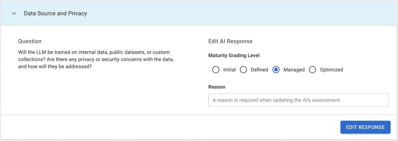
I put a dropdown list at the top so a reviewer can see how many questions across categories. I gave each question a category label above the question itself, so a reviewer finds the area they want before opening the full content.
I labeled the maturity level and the reasoning as AI generated, so a reviewer can see the source of what they are approving. I explored a priority tag for the queue and dropped it after the engineering team confirmed a technical restriction.


Add progress visibility so validators can pace their work
Validators typically work through dozens of questions across multiple categories. Showing progress reduces cognitive load and helps them pace the session.
A priority tag was explored but dropped after confirming a technical restriction with the engineering team.
Separate Review vs Edit to avoid accidental changes
I moved editing into its own step, so a reviewer confirms first and corrects second, and the short path stays short for the assessments that need no edit.
Result
Both participants started without asking where to begin. Task time dropped roughly 30 percent against the baseline.
Decision #2
Project context
Problem
Users lost track of which project they were viewing when switching between assessments.

Design question
How might we provide clear project context and ensure critical anomalies are surfaced first, so users can focus on what matters?
The solution
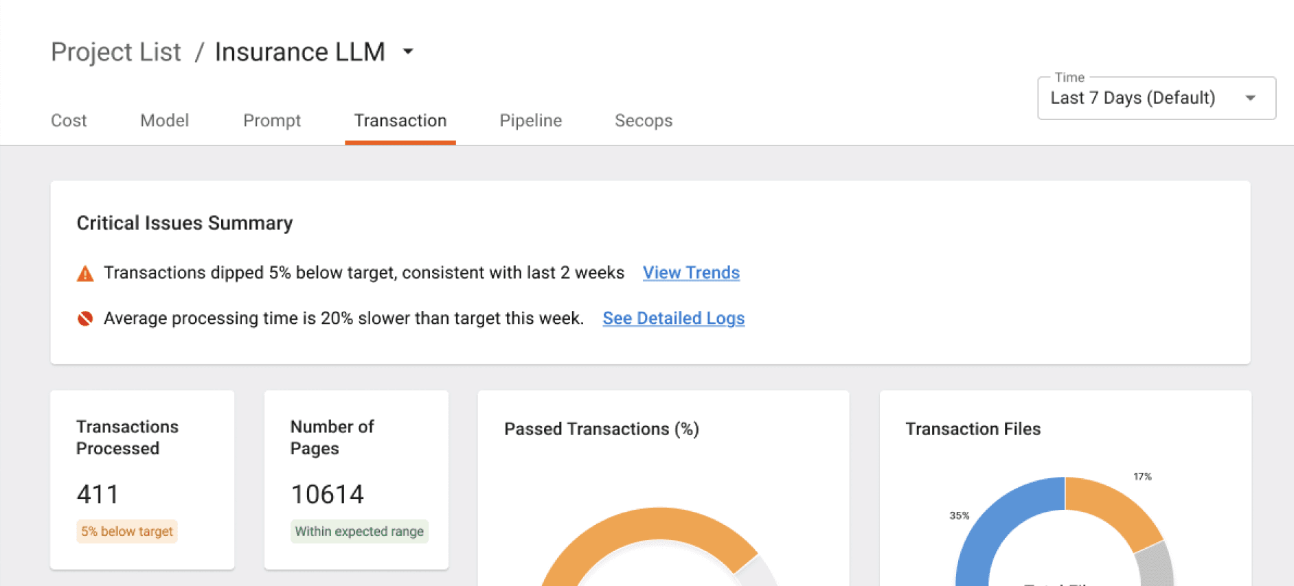
I added a page title and breadcrumb with a project switcher in the header, so a reviewer moves between projects without going back to the project list.

I added a summary card that leads with the critical anomalies and links down into the detailed data, so nobody has to read every chart to know whether the system is healthy.
Visual refinements
Minor adjustments to chart styling and spacing improved readability and maintained consistency across the dashboard.

Result
Both participants named the active project without prompting. Time to locate an anomaly dropped by roughly half.
What the research changed
One finding sat outside my scope, and nobody had asked me to look at it.
The developers never named assignment as a problem because they were the workaround. Every new user and every project move already reached them as a ticket. The admin sat on the other side of the same process, approving access requests by hand.
I wrote a feature proposal and pitched it to the stakeholder's manager. Three of the features were approved and added to the Phase 2 design scope, and I designed them.
Project Access Requests & Approval
Previously, access changes required manual, backend-dependent handoffs between developers, managers, and admins.
With the new features, developers and managers can view all available projects and request access directly, while admins can assign projects to users or review and respond to access requests.


Notifications
A notification panel displayed relevant alerts based on user role.
Users can quickly jump from a notification to the related page.

looking back
What changed my thinking.
This project pushed me to think beyond immediate fixes and consider long-term product impact. It reinforced a habit I now carry forward: asking “What happens when this scales?” and using that lens to guide workflow and system decisions.