Turning a static feature catalog into a guided journey
ChangeGuide is an AI assistant for OCM practitioners. I led a four-week redesign sprint within a longer engagement, redesigning the chat experience and the landing page for two audiences: practitioners who need to get started, and potential clients evaluating whether to buy. The redesign is currently in development.
*Product name changed for confidentiality
Role
Sole Product Designer
Timeline
4 weeks · 2026
Team
PM · 4 Engineers · 4 experts
Type
B2B · Enterprise SaaS · AI UX
BACKGROUND
Change management work is manual by default.
65%
of OCM activities are manual, leaving little time for strategic work
45%
projected cost savings by automating repetitive tasks with AI
INITIAL AUDIT
What I noticed before talking to users.
Product features cards confused users
The original homepage had six static capability cards showing what the product could do. However, nothing on the page told users how to start, or why it mattered to them.
Getting to chat required unnecessary setup.
Before sending a single message, users had to create a project, click "Get Started," and locate the input field. That gap made users leave before they tried anything.
Research
Reframing a UI request into a product alignment problem.
The project began with a request to redesign the landing page around a prioritized feature list. In the first two days, I ran competitive analysis, desk research, and three mid-fidelity concepts to explore different ways of introducing the product. The concepts were conversation starters for aligning with non-technical stakeholders, not final designs.
During the first stakeholder review, I realized the team wasn't ready to evaluate interface solutions yet. We had to align on what the product experience should be before we could evaluate any interface. I facilitated that alignment first, then expanded the work beyond the landing page by gathering input from practitioners, stakeholders, and engineers before making design decisions.
Research focused on three perspectives.
How do OCM experts actually work?
Journey Mapping Workshop
User Interviews

What should this product become?
Stakeholder Alignment Sessions
OCM Task Analysis

What can the AI realistically support?
Technical Discussions
Constraint Mapping

KEY FINDINGS
Three insights changed the design direction.
OCM practitioners think in activities, not product features.
The interviews showed that practitioners naturally organize work around change activities like stakeholder analysis and training plans. Product capabilities are not how they think.
Users expect AI to help immediately.
Practitioners arrive with a specific task in mind. Asking them to create a project before getting help delays the moment they receive value.
“If we could create our plans really early and quickly, then we can get to the good stuff." - Cindy, OCM Lead

Technical constraints shaped the interaction model.
Users found document generation too rigid, while engineers identified token limitations that made combining chat and document generation unreliable.
Key decisions
Three decisions shaped the experience.
Decision #1
Chat vs. Document Generation
Problem
Users wanted to explore ideas through conversation and also generate structured OCM deliverables. These are two different tasks. Chat is for exploration, document generation is for execution. Combining them in one interface created two problems:
Conversations became harder to follow
Document generation became less reliable because of model and token constraints
One OCM lead described the document workflow as "rigid" because it repeatedly asked for the same context before generating an output.
Design question
Should both workflows live in one interface, or become two dedicated experiences?
Together with engineering, we explored separating chat and document generation into dedicated workspaces. The proposal originated from technical constraints. I reframed it around user intent, since conversation and document creation are fundamentally different tasks.
Why this direction
Separating the two modes would reduce cognitive switching. Chat would be a place to think through a problem, and document generation a place to produce a structured deliverable. Clear boundaries would also make failures easier to understand, for both users and engineers.
Stakeholders wanted to validate the integrated version first. I documented the rationale and left the recommendation for whoever picked it up next.
Decision #2
Interactive Journey Explorer
Problem
Users could see the product’s capabilities, but not where they were in the change journey or what to do next.
Design question
Should the experience be organized around deliverables or the OCM journey?
Deliverable-based
Optimized for creating outputs
Best for experienced practitioners
Users choose what to create
Direct access to deliverables
Phase-based
Selected
Optimized for learning the workflow
Better onboarding for potential client and new users
Users know what to do next
Guides users to the next step
Why I chose it
The phase-based version showed users where they were in the change process before asking them to act. It surfaced the right tasks and deliverables at each stage, instead of leaving users to pick from a list of capabilities.
Interactive Journey & Task Explorer on the product marketing landing page
Decision #3
Quick Chat
Problem
Every conversation had to belong to a project. New users had to create a project before sending their first message, interrupting their workflow before they received any value.
Design question
How can users start chatting immediately without breaking the project’s organizational model?

Auto-create projects
Creates a project automatically
Removes setup friction
Keeps conversations organized
Creates many empty projects
Temporary Quick Chat
Selected
Starts outside a project
Removes setup friction
Lets users organize later
Requires users to save intentionally
Why I chose it
Auto-creating projects removes the setup step but creates clutter. Users accumulate unnamed projects with no clear ownership. Temporary Quick Chat lets users start with a task and commit to a project only when the conversation is worth keeping.
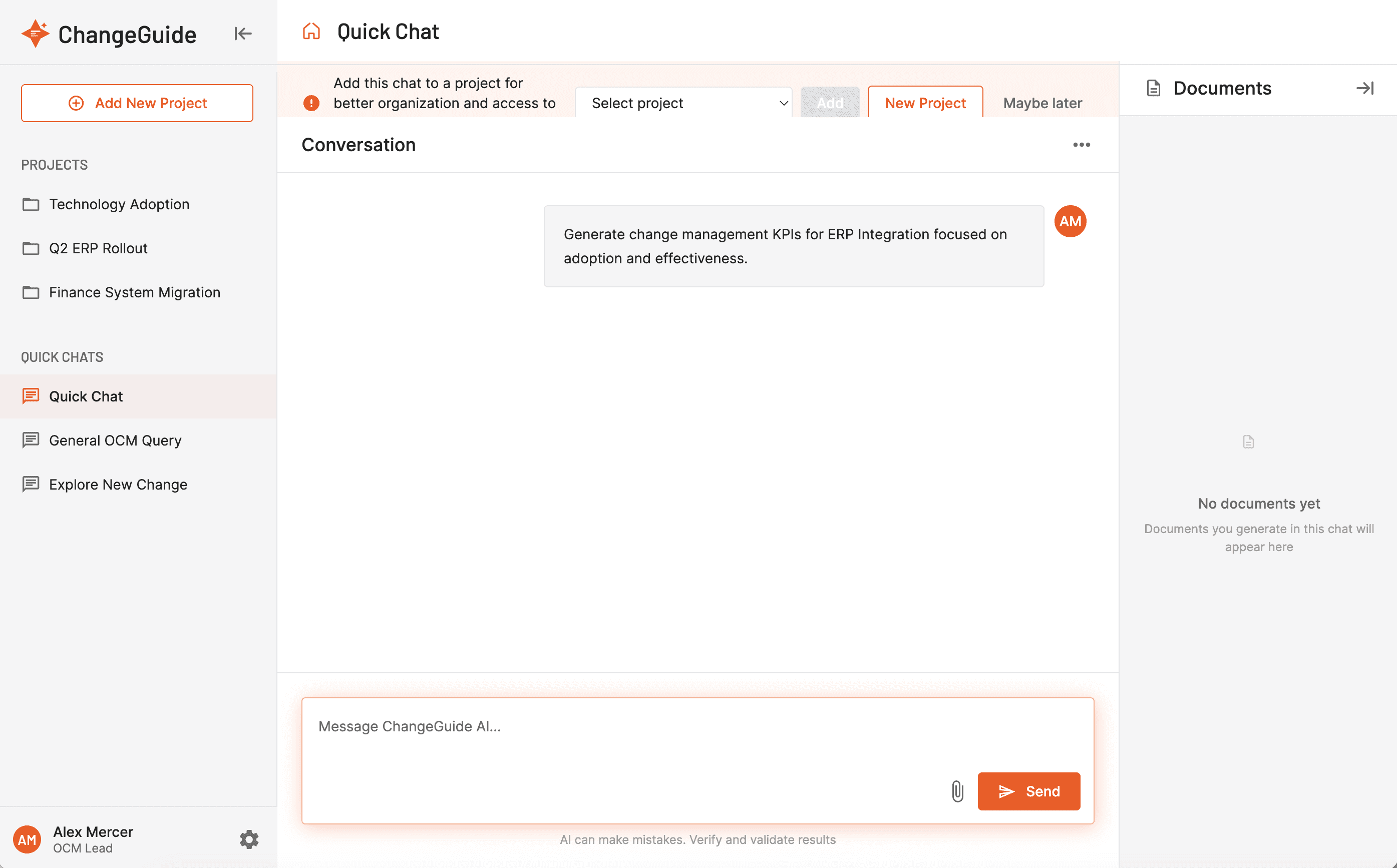
Quick Chat Conversation UI
Trade-off
Too many unsaved Quick Chats created the same clutter problem. I added a banner prompting users to move the chat to a project when they are ready.
the connected EXPERIENCE
The three decisions connect into one guided workflow.
Together, the three decisions transformed ChangeGuide from a feature catalog into a guided workflow that helps practitioners move from exploring a problem to producing a deliverable.
impact
Delivered in four weeks as the sole product designer.
Business
The landing page replaced live product walkthroughs in client sales conversations.
Product
I designed a connected onboarding experience across discovery, conversation, and document generation.
Collaboration
I documented my recommendation to separate Chat and Document Generation, and left the rationale for the team to take forward.
*Because the project was handed off before launch, long-term product metrics were not yet available.
looking back
What this project changed about how I design AI products.
Lesson 1
The first problem is rarely the real problem.
This project began as a landing page redesign. The real challenge was aligning user workflows, business goals, and technical constraints before designing the interface.
Lesson 2
Technical constraints shaped the design more than preferences did.
The strongest product decisions came from understanding how the AI behaved. Interface polish came after. Working closely with engineers helped turn technical constraints into clearer product boundaries.
Lesson 3
Domain experts need something concrete to react to.
Before my first workshop, I thought I understood the product well enough to map the journey. I was wrong. Open-ended discussions stayed abstract. Bringing rough concepts into the room helped stakeholders react, disagree, and align faster.